

In the competitive local market of Surrey and the South East, your website is often the first interaction a potential customer has with your business. It’s more than just a digital brochure; it’s your hardest-working employee, available 24/7 to generate leads, answer questions, and build trust. Yet, many small businesses struggle with websites that fail to convert visitors into customers. Common issues like slow loading times, confusing navigation, or a poor mobile experience can quickly send potential clients to a competitor. This isn’t about having the flashiest design; it’s about creating a functional, user-friendly asset that supports your business goals.
This comprehensive guide cuts through the noise and technical jargon to provide a clear, actionable roundup of website design best practices. We will explore ten essential pillars that form the foundation of a high-performing website, from mobile-first responsiveness and lightning-fast loading speeds to intuitive navigation and robust security. For local service providers, tradespeople, and retailers in the UK, implementing these principles is crucial for standing out, improving local SEO, and turning your online presence into a reliable lead-generation engine.
You will learn not just what to do, but how to implement these strategies effectively. Each section offers practical steps and real-world context tailored for business owners who are often time-poor and need straightforward, results-focused advice. Whether you are planning a new website, refreshing an existing one, or simply want to ensure your digital storefront is working as hard as you do, these proven practices will provide the framework for success. Let’s dive into the core elements that will transform your website from a simple online listing into a powerful business tool.
- 1. Mobile-First Responsive Design
- 2. Fast Loading Speed Optimization
- 3. Intuitive Navigation Structure
- 4. Clean and Readable Typography
- 5. User-Centered Design (UCD)
- 6. Consistent Visual Design System
- 7. Clear Call-to-Action (CTA) Optimisation
- 8. Web Accessibility (WCAG) Compliance
- 9. Search Engine Optimization (SEO) Integration
- 10. Security and Privacy Protection
- Website Design Best Practices Comparison
- Final Thoughts
1. Mobile-First Responsive Design
More users will likely visit your website on a mobile phone than on a desktop computer. This shift in user behaviour makes a mobile-first approach not just a good idea, but an essential component of modern website design best practices. This philosophy involves designing for the smallest screen first-typically a smartphone-and then progressively enhancing the design for larger screens like tablets and desktops. By prioritising the mobile experience, you ensure your site is fast, accessible, and user-friendly for the majority of your visitors, which is crucial for small businesses targeting local customers on the go.

This method, popularised by designers like Luke Wroblewski and supported by Google’s mobile-first indexing, forces you to focus on what truly matters: your core content and primary calls-to-action. By stripping away non-essential elements for the mobile view, you create a cleaner, more focused user journey. Global brands like Starbucks and Airbnb excel at this, offering a seamless and consistent experience whether a customer is ordering a coffee or booking a stay from their phone or computer.
How to Implement a Mobile-First Strategy
To adopt this approach, your design process must start with a mobile viewport, often around 320px wide. Use fluid grids and flexible units like percentages (%) or ems instead of fixed pixels to allow your layout to adapt gracefully.
- Prioritise Content: Organise your content hierarchy for the small screen. What is the single most important action you want a user to take? Make that prominent.
- Optimise Touch Targets: Ensure all buttons and links are at least 44×44 pixels. This prevents user frustration from accidental taps.
- Use CSS Media Queries: These are the technical foundation of responsive design, allowing you to apply different styles as the screen size increases.
- Test on Real Devices: While browser developer tools are useful, nothing beats testing your site on actual iPhones and Android devices to catch real-world usability issues.
FAQs About Mobile-First Design
1. What is the difference between mobile-first and responsive design?
Responsive design makes a site adapt to different screen sizes. Mobile-first is a strategy within responsive design that starts the design process with the mobile version, rather than shrinking a desktop version down.
2. Why is mobile-first important for local SEO?
Google primarily uses the mobile version of a website for indexing and ranking (mobile-first indexing). A poor mobile experience can directly harm your visibility in local search results, especially for “near me” searches made on phones.
3. Will a mobile-first site look too simple on a desktop?
No. The “progressive enhancement” part of the strategy means you add more features, complex layouts, and richer content as screen space increases, ensuring the desktop version feels complete and engaging.
4. Is a mobile-first approach more expensive to develop?
Initially, it can require more planning, but it often leads to a more efficient and streamlined development process. It prevents the need for costly redesigns to fix a poor mobile experience later on.
5. How can I check if my current website is mobile-friendly?
You can use Google’s free Mobile-Friendly Test tool. Simply enter your website’s URL to get an instant analysis and recommendations.
2. Fast Loading Speed Optimization
In a world of instant gratification, a slow website is a business killer. Fast loading speed is no longer a luxury; it’s a foundational element of modern website design best practices. This involves meticulously optimising every part of your website to ensure it loads for visitors in under three seconds. A faster site not only provides a better user experience, keeping potential customers engaged, but it’s also a significant ranking factor for search engines like Google. For a small business in Surrey, a speedy website can be the difference between a new local customer and a frustrated visitor who clicks away to a competitor.

The impact of loading speed is well-documented by major corporations. Amazon famously calculated that a mere 100-millisecond delay could cost them 1% in sales. Similarly, Pinterest reduced its load times by 40% and saw a 15% increase in user sign-ups and engagement. These figures, popularised by web performance pioneers like Steve Souders and Google’s own Ilya Grigorik, prove that speed directly translates to conversions and revenue. You can find out more about how to achieve this by exploring these website performance best practices.
How to Implement Speed Optimisation
Achieving a fast website requires a multi-faceted approach, starting with a thorough analysis using tools like Google PageSpeed Insights or GTmetrix to identify bottlenecks.
- Compress and Optimise Images: Use modern formats like WebP where possible and always compress images before uploading. Large image files are one of the most common causes of slow pages.
- Leverage Browser Caching: Configure your server to tell browsers to store static files (like your logo, CSS, and JavaScript) locally. This makes subsequent page loads almost instant for repeat visitors.
- Minimise Code and Scripts: Reduce your reliance on plugins and third-party scripts. Combine and minify your CSS and JavaScript files to reduce the number of requests the browser has to make.
- Enable Server-Side Compression: Use GZIP compression on your web server to drastically reduce the file size of your site’s code before it’s sent to the user’s browser.
FAQs About Loading Speed
1. What is a good page load time to aim for?
A good target is under 3 seconds. According to Google, 53% of mobile users will abandon a page if it takes longer than 3 seconds to load. For e-commerce, aiming for under 2 seconds is ideal.
2. How does page speed affect my SEO?
Google uses page speed, particularly the metrics known as Core Web Vitals, as a direct ranking signal. A faster website provides a better user experience, which Google rewards with higher visibility in search results.
3. Will optimising my website for speed be expensive?
Not necessarily. Many powerful optimisation techniques, like compressing images and enabling GZIP, can be done with free tools or simple server configurations. While a full professional audit has a cost, the return on investment from improved conversions and SEO is often significant.
4. What are Core Web Vitals?
Core Web Vitals are a set of three specific metrics Google uses to measure a page’s real-world user experience: Largest Contentful Paint (loading performance), First Input Delay (interactivity), and Cumulative Layout Shift (visual stability).
5. Can my web hosting affect my website speed?
Absolutely. A cheap, low-quality shared hosting plan can significantly slow down your site, no matter how well it is optimised. Investing in reliable hosting is a critical first step for good performance.
3. Intuitive Navigation Structure
If your website is a digital storefront, its navigation is the floor plan and signage. An unclear layout will cause visitors to leave in frustration, but an intuitive navigation structure guides them effortlessly to what they need. This is a cornerstone of website design best practices, focusing on creating a logical, predictable, and user-friendly system that helps people move through your site without having to think. A well-organised menu is crucial for small businesses in Surrey, as it directly impacts how potential local customers find your services, contact details, or product pages.
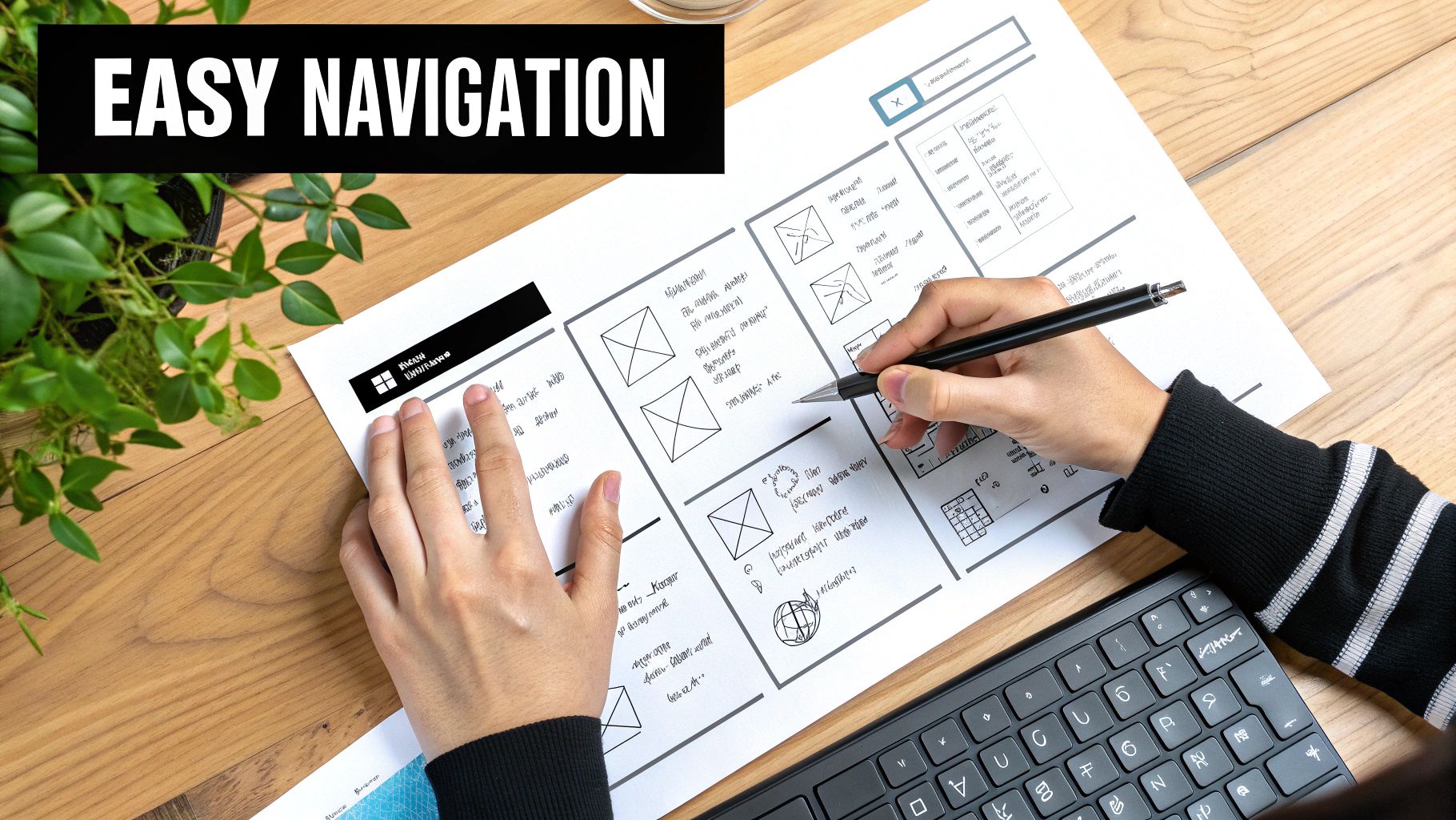
This principle, championed by usability experts like Steve Krug in his book Don’t Make Me Think, emphasises clarity over cleverness. Your website isn’t the place for mystery or puzzles; it’s a tool to serve your customers. Brands like Apple and Mailchimp exemplify this with their minimalist yet highly effective navigation menus. They use clear, action-oriented labels and logical groupings that allow users to find information quickly, whether they are on a desktop or mobile device. This builds trust and reduces bounce rates, ensuring visitors stay longer and are more likely to convert.
How to Implement Intuitive Navigation
Creating a seamless user journey starts with a well-planned site structure. Your goal is to make finding key information so easy it feels instinctive.
- Limit Main Menu Items: Stick to a maximum of seven main navigation items. This psychological principle, known as Miller’s Law, prevents cognitive overload and keeps choices manageable.
- Use Descriptive Labels: Avoid jargon or overly creative names. Use clear, simple terms like “Services,” “About Us,” or “Contact” instead of “Our Journey” or “Connect.”
- Implement a Search Function: For sites with a lot of content, like a blog or a large e-commerce shop, a prominent search bar is essential.
- Organise with a Sitemap: Before you build, map out your site’s pages. A sitemap helps you visualise the user flow and create a logical hierarchy.
- Provide Visual Feedback: Use hover states (e.g., a colour change) on menu items to show they are clickable. For mobile, ensure active pages are highlighted in the navigation.
FAQs About Intuitive Navigation
1. What is the difference between a navigation menu and a sitemap?
A navigation menu is the user-facing interface (e.g., the bar at the top of a site) that visitors use to move between pages. A sitemap is a file that lists all the pages on your website, primarily for search engines to understand and crawl your site’s structure, though it can also be a user-facing page on complex sites.
2. How does good navigation impact SEO?
Good navigation helps search engines like Google understand the relationship between your pages and which content is most important. It also improves user experience metrics (like time on site and bounce rate), which are important ranking signals. A logical structure allows “link equity” to flow effectively through your site.
3. What are “breadcrumbs” in web navigation?
Breadcrumbs are a secondary navigation aid that shows users their current location within the site’s hierarchy (e.g., Home > Services > Plumbing). They are particularly useful for large websites, helping users to easily navigate back to previous pages.
4. Should my navigation be the same on mobile and desktop?
The links should be consistent, but the presentation will differ. On desktop, you might have a horizontal menu. On mobile, this typically collapses into a “hamburger” icon (three horizontal lines) that users tap to reveal the menu, saving valuable screen space.
5. How many clicks should it take to get to any page?
A common guideline is the “three-click rule,” which suggests any page on your site should be accessible within three clicks from the homepage. While not a rigid law, it’s a useful principle for keeping your site structure flat and your content accessible.
4. Clean and Readable Typography
Text is the primary way you communicate with visitors, making typography one of the most critical, yet often overlooked, website design best practices. It involves the strategic use of fonts, sizes, spacing, and hierarchy to create text that is not only visually appealing but also effortless to read. For a small business in Surrey, clear typography builds trust and professionalism, ensuring your message is delivered effectively without causing user fatigue or confusion.
This discipline, championed by typographers like Erik Spiekermann and Oliver Reichenstein, directly impacts user experience. Excellent typography guides the reader’s eye, establishes an information hierarchy, and reinforces your brand’s personality. Companies like Stripe use clean, modern typography to project competence and build trust, while platforms such as Medium have perfected the online reading experience, making long-form content feel accessible and engaging.
How to Implement Clean Typography
Getting typography right means focusing on clarity and consistency. Start by choosing typefaces that reflect your brand and are optimised for screen use.
- Limit Your Fonts: Stick to a maximum of two or three font families. Use one for headings (a ‘display’ font) and another for body text (a ‘serif’ or ‘sans-serif’ font).
- Establish a Clear Hierarchy: Use different font sizes, weights (e.g., bold), and styles to distinguish between headings (H1, H2, H3) and paragraph text.
- Prioritise Readability: Aim for a body text font size of at least 16px. Use a line height between 1.4 and 1.6 to ensure there is enough space between lines of text.
- Ensure Sufficient Contrast: Text must be legible against its background. Follow the WCAG guidelines for a minimum colour contrast ratio of 4.5:1.
FAQs About Website Typography
1. What is the difference between a serif and a sans-serif font?
Serif fonts (like Times New Roman) have small decorative lines or “feet” at the ends of their characters, often used for a traditional or classic feel. Sans-serif fonts (like Arial) do not have these lines, offering a cleaner, more modern look that is generally easier to read on digital screens.
2. Why should I use Google Fonts or system fonts?
Google Fonts are free, web-optimised, and load reliably across different browsers and devices, preventing your site from looking broken if a user doesn’t have a specific font installed. System fonts (like Arial or Georgia) are already on a user’s device, so they load almost instantly.
3. How many font styles are too many?
A good rule is to limit yourself to 2-3 font families and a few well-chosen weights (e.g., regular, italic, bold). Using too many fonts or styles creates visual chaos and makes your website look unprofessional and difficult to read.
4. Does typography affect SEO?
Indirectly, yes. Good typography improves user experience, reduces bounce rates, and increases the time visitors spend on your page. These are positive user engagement signals that search engines like Google consider when ranking websites.
5. How do I check my website’s text for colour contrast?
You can use free online tools like WebAIM’s Contrast Checker. Simply input the hexadecimal codes for your text and background colours to see if they meet accessibility standards.
5. User-Centered Design (UCD)
At its core, great web design solves problems for real people. User-Centered Design (UCD) is a powerful philosophy that places your customers’ needs, behaviours, and goals at the very heart of the entire design process. Instead of guessing what users want, UCD insists on finding out through research and feedback, making it one of the most crucial website design best practices for creating a website that truly connects and converts. It is an iterative process involving user research, persona development, and usability testing to drive improvements.
This approach, championed by industry leaders like Don Norman and the Nielsen Norman Group, ensures the final product is intuitive and valuable. For a small business in Surrey, this means designing a website that helps a local customer quickly find your opening hours, book a service, or understand your offerings without any confusion. Global brands like Netflix and Uber live by UCD, using extensive user data to create personalised, friction-free experiences that keep users coming back.
How to Implement a User-Centered Design Strategy
Adopting UCD requires a shift in mindset from “what we want to build” to “what our users need to achieve”. This involves continuous learning and adapting based on real human interaction.
- Conduct User Research: Before you design a single page, talk to your target customers. Use surveys, interviews, or simple conversations to understand their pain points and what they expect from your website.
- Create User Personas: Develop detailed profiles of your ideal customers. Give them names, goals, and motivations. This helps your team empathise and design for a specific person, not a vague audience.
- Map the User Journey: Visualise the path a user takes on your website to complete a goal, like making a purchase or filling out a contact form. Identify potential obstacles and areas for improvement.
- Test and Iterate: Build simple prototypes (wireframes) and test them with real users. Use their feedback to refine the design before investing in full development. This saves time and money.
FAQs About User-Centered Design
1. What is the main benefit of UCD for a small business?
The main benefit is creating a website that generates better results, whether that’s more leads, sales, or phone calls. By focusing on the user, you reduce frustration, build trust, and make it easier for customers to do business with you.
2. Isn’t user research expensive and time-consuming?
It doesn’t have to be. For a small business, research can be as simple as interviewing five past customers or sending a short online survey. The insights gained are far more valuable than the minimal time and cost invested.
3. How is UCD different from User Experience (UX) design?
UCD is a design philosophy or process that prioritises the user. UX design is the practice of creating the overall experience a user has with your product. UCD is the ‘how’, while UX is the ‘what’. You use a UCD process to achieve good UX. If you’d like to explore this topic further, you can learn more about the differences between UX and UI on gfctech.co.uk.
4. Can I apply UCD to my existing website?
Absolutely. You can use tools like Google Analytics to understand user behaviour, install heat-mapping software to see where people click, and add a feedback form to gather direct input for future improvements.
5. How do I create a user persona?
Start by gathering demographic data (age, location, job) and psychographic data (goals, challenges, values) about your target audience. Combine this information into a fictional character profile that represents a key segment of your user base.
6. Consistent Visual Design System
A consistent visual design system acts as the single source of truth for your website’s appearance, ensuring every page and element feels cohesive and professional. It’s a comprehensive library of reusable components and clear standards governing everything from colour palettes and typography to button styles and spacing. This is a fundamental website design best practice that builds brand recognition and user trust, making your site easier to navigate and more credible for potential customers.
This methodology, popularised by frameworks like Google’s Material Design and Brad Frost’s atomic design, prevents the chaotic “Frankenstein” look where different parts of a website seem cobbled together. For a small business in Surrey, this means a customer viewing your services page gets the same professional impression when they move to your contact form or blog. Large-scale systems like Shopify’s Polaris demonstrate how a consistent design language streamlines the user journey, guiding customers intuitively towards making a purchase.
How to Implement a Visual Design System
Start by documenting your core visual identity and then build out from there. The goal is to create a living style guide that can evolve with your brand and be easily understood by any designer or developer.
- Establish Core Foundations: Define your primary and secondary colour palettes, typography scales (headings, body text), and spacing rules.
- Create Reusable Components: Design standard components like buttons, forms, navigation menus, and cards. Ensure they have defined states (e.g., hover, active, disabled).
- Document Everything: Create a central style guide that explains how and when to use each element. Include rationale to help your team make consistent decisions.
- Conduct Regular Audits: Periodically review your live website to check for inconsistencies and ensure all new pages adhere to the established system.
FAQs About Visual Design Systems
1. Isn’t a design system only for large corporations?
Not at all. Even a simple, one-page style guide is a form of design system. For small businesses, it ensures brand consistency, speeds up future updates, and makes it easier to work with freelance designers or developers.
2. What is the difference between a style guide and a design system?
A style guide typically focuses on static visual elements like colours and logos. A design system is more comprehensive, including interactive components, code snippets, and usage guidelines, making it a functional toolkit for building and maintaining a website.
3. Will a design system limit creativity?
On the contrary, a good design system liberates creativity. By handling the repetitive, foundational design decisions, it frees up time and mental energy to focus on solving more significant user experience challenges and creating unique layouts.
4. How much does it cost to create a design system?
The initial setup requires an investment of time and planning. However, this upfront effort pays off by dramatically reducing the time and cost of designing new pages or features in the future, as the core building blocks are already in place.
5. What tools can I use to build a design system?
Digital design tools like Figma, Sketch, and Adobe XD are excellent for creating and managing design systems. They allow you to create reusable components and styles that can be shared easily with your entire team.
7. Clear Call-to-Action (CTA) Optimisation
A beautiful website is only effective if it guides visitors to take a specific, valuable action. This is where Clear Call-to-Action (CTA) Optimisation comes in, a critical component of website design best practices. This involves the strategic design and placement of buttons and links that prompt users to make a purchase, fill out a form, or download a guide. An effective CTA cuts through the noise and tells your visitor exactly what to do next, turning passive browsing into active engagement.
This principle, championed by conversion rate optimisation leaders like Unbounce and HubSpot, is about making the desired action the most obvious and compelling choice on the page. For a small business in Surrey, this could be the difference between a visitor leaving your site or booking a consultation. Brands like Spotify with its “Get Spotify Free” button or Netflix’s “Join Free for a Month” offer master this by combining urgent, value-driven language with visually striking design, making the decision to click almost effortless.
How to Implement Effective CTAs
To optimise your CTAs, you must think about visibility, language, and placement. The goal is to create a clear path for the user that aligns with your business objectives.
- Use Action-Oriented Verbs: Start your CTA text with strong verbs like ‘Get’, ‘Start’, ‘Join’, or ‘Discover’. This creates a sense of immediacy and clarity.
- Create Visual Contrast: Your primary CTA button should stand out from other page elements. Use a bold, contrasting colour that draws the eye but still fits your brand palette.
- Strategic Placement: Position your main CTA “above the fold” so it’s visible without scrolling. Repeat it further down the page for longer content.
- A/B Test Everything: Don’t guess what works best. Test different button colours, copy, shapes, and positions to see what drives the highest conversions.
- Design for Mobile: Ensure CTA buttons are large enough to be easily tapped on a mobile screen, with a recommended minimum size of 44×44 pixels.
FAQs About CTA Optimisation
1. How many CTAs should I have on one page?
It’s best to have one primary CTA that represents the main goal of the page (e.g., “Buy Now”). You can include secondary, lower-contrast CTAs for alternative actions (e.g., “Learn More”), but avoid cluttering the page and causing decision paralysis.
2. What colour is best for a CTA button?
There is no single “best” colour. The most effective colour is one that creates high contrast with the background and surrounding elements on your specific page, making it instantly noticeable.
3. What is the difference between a CTA and a contact form?
A CTA is the button or link that prompts the action (e.g., “Contact Us Today”). The contact form is the set of fields the user fills out after clicking that CTA. Optimising your website’s calls-to-action is vital, extending even to the design of your forms. For practical examples of forms that convert, consider exploring these high-converting contact forms.
4. Should my CTAs be the same on every page?
Not necessarily. Your CTAs should be relevant to the content of each specific page. A blog post might have a CTA to “Subscribe to our Newsletter,” while a service page should have a CTA to “Request a Quote.”
5. How do CTAs relate to landing pages?
CTAs are fundamental to landing pages, which are specifically designed around a single conversion goal. A strong CTA is the centrepiece of an effective landing page, and you can learn more about creating effective landing pages.
8. Web Accessibility (WCAG) Compliance
An accessible website is one that can be used by everyone, regardless of their abilities or disabilities. This is not just a moral obligation but a cornerstone of modern website design best practices, ensuring your services and information are open to the entire community. Web accessibility involves following the Web Content Accessibility Guidelines (WCAG) to make your site navigable and understandable for people using assistive technologies like screen readers, or for those with visual, auditory, motor, or cognitive impairments. For a small business in the UK, this widens your potential customer base and demonstrates a commitment to inclusivity.
Making your website accessible is also a legal necessity under the UK’s Equality Act 2010. Industry leaders like the BBC and GOV.UK set a high standard for accessibility, providing a seamless experience for all users. Conversely, high-profile legal cases, such as the one involving Target in the US, have highlighted the significant commercial and reputational risks of neglecting digital inclusion, reinforcing its importance for businesses of all sizes.
How to Implement Web Accessibility
Achieving compliance starts with adopting an inclusive mindset during the design and development phases. The goal is to remove barriers that prevent interaction with, or access to, websites by people with disabilities.
- Use Semantic HTML: Structure your content correctly with elements like
<header>,<nav>,<main>, and<footer>. This provides a clear roadmap for screen readers. - Provide Alt Text: Every functional or informative image must have descriptive alternative text (
altattribute) so visually impaired users understand its purpose. - Ensure Colour Contrast: Text should have a contrast ratio of at least 4.5:1 against its background. This helps users with low vision or colour blindness.
- Enable Keyboard Navigation: All interactive elements, including links, buttons, and form fields, must be fully operable using only a keyboard.
- Test with Real Tools: Use tools like WAVE or Axe DevTools and test your site with a screen reader (like NVDA or VoiceOver) to find and fix real-world issues.
FAQs About Web Accessibility
1. What are the WCAG levels?
WCAG has three levels of conformance: A (minimum), AA (standard), and AAA (highest). For most businesses, including those in the UK, aiming for AA compliance is the accepted standard and a legal requirement for public sector bodies.
2. Is web accessibility expensive for a small business?
Building accessibility in from the start is far more cost-effective than retrofitting it later. While it requires mindful planning, many best practices (like semantic HTML) are part of good quality web development and shouldn’t add significant extra cost.
3. Does accessibility hurt my website’s design?
Not at all. Accessibility and beautiful design are not mutually exclusive. Inclusive design principles often lead to cleaner, more intuitive, and user-friendly layouts that benefit every single visitor, not just those with disabilities.
4. How does accessibility impact SEO?
There is a strong overlap. Practices like using alt text, proper heading structures, and providing transcripts for videos are great for both accessibility and SEO. A site that is easier for assistive technologies to navigate is also easier for search engine crawlers to understand.
5. How can I quickly check my site’s basic accessibility?
You can use a free browser extension like the WAVE Web Accessibility Evaluation Tool to get an instant report on potential issues like contrast errors, missing alt text, and structural problems.
9. Search Engine Optimization (SEO) Integration
Building a beautiful website is only half the battle; ensuring potential customers can find it is the other crucial half. This is where Search Engine Optimisation (SEO) becomes a foundational element of website design best practices. SEO is the practice of structuring and creating your website in a way that is easily understood by search engines like Google. By integrating SEO from the very start of the design process, you ensure your site is built to rank, attract organic traffic, and generate leads for your small business.
This approach means thinking about keywords, site structure, and user experience long before the site goes live. It’s not an afterthought but a core component of the build. Industry leaders like HubSpot and Moz demonstrate this perfectly; their websites are not only user-friendly but are also powerful content hubs meticulously optimised to rank for thousands of industry-relevant search terms, establishing them as authorities in their field.
How to Integrate SEO into Your Website Design
Effective SEO starts with a technical and content-led strategy. This ensures your website is both discoverable by search engine crawlers and valuable to human visitors.
- Keyword Research First: Before writing any copy or even planning your pages, research what your target customers in Surrey are searching for. Use these keywords to plan your site architecture and content.
- Logical URL Structure: Create simple, descriptive URLs that include your primary keyword for that page. For example, use
/services/plumbing-repairsinstead of/page-id-123. - Optimise Your Images: Use descriptive filenames (e.g.,
local-surrey-builder.jpg) and write compelling alt text that describes the image and includes relevant keywords. This helps with both accessibility and image search rankings. - Write Compelling Meta Tags: Your title tag and meta description are your sales pitch in search results. Keep titles under 60 characters and descriptions under 155 characters to avoid them being cut off.
FAQs About SEO Integration
1. What’s more important: website design or SEO?
They are equally important and deeply interconnected. A great design with no SEO will struggle to attract visitors, while a site with great SEO but a poor user experience will fail to convert them. The best approach integrates both from the beginning.
2. How long does it take for SEO to show results?
SEO is a long-term strategy. While some initial results can be seen within 3-6 months, it often takes 6-12 months of consistent effort to see significant, lasting impact on your rankings and traffic, especially in competitive local markets.
3. Can I do SEO myself for my small business?
Yes, basic on-page SEO like optimising titles, meta descriptions, and content is achievable for many business owners. However, technical SEO, link building, and local SEO strategy often require specialised expertise to be truly effective.
4. What is the difference between on-page and off-page SEO?
On-page SEO refers to optimisations you make directly on your website (e.g., content, keywords, site speed). Off-page SEO refers to actions taken outside of your website to improve its authority, such as building backlinks from other reputable local sites.
5. How much does SEO cost for a small business in the UK?
Costs can vary widely. A one-off project or audit might cost a few hundred pounds, while ongoing monthly retainers for a local business in Surrey can range from £400 to over £1,500, depending on the scope and competitiveness of the industry.
10. Security and Privacy Protection
In an age where data breaches are common and user privacy is a major concern, robust security is no longer an optional extra; it’s a foundational element of trustworthy website design best practices. Protecting your website and your users’ data builds credibility, ensures compliance with legal standards, and safeguards your business’s reputation. For a small business in Surrey, demonstrating that you take security seriously can be a significant differentiator, assuring local customers that their information is safe with you.
Prioritising security involves a multi-layered approach, from encrypting data in transit with SSL certificates to protecting against common vulnerabilities. Organisations like the Open Web Application Security Project (OWASP) provide frameworks for this, while privacy-first brands like Signal and ProtonMail set a high standard for user trust. For any business handling transactions, looking to security leaders like Stripe for inspiration is a wise move, as they have built their entire brand on a foundation of impenetrable security.
How to Implement Security and Privacy Measures
A secure website is built on consistent, proactive habits rather than a one-time fix. Start by implementing these core protections to create a safe online environment for your visitors.
- Install an SSL Certificate: This enables HTTPS, encrypting data sent between a user’s browser and your server. Many hosting providers and services like Let’s Encrypt offer free SSL certificates.
- Keep Everything Updated: Regularly update your website’s core software (like WordPress), themes, and plugins to patch security vulnerabilities as they are discovered.
- Use Strong Credentials: Enforce the use of strong, unique passwords for all admin accounts and consider implementing two-factor authentication (2FA) for an extra layer of security.
- Conduct Regular Security Audits: Use tools to scan your site for malware and vulnerabilities. Many security plugins can automate this process for you.
- Establish a Clear Privacy Policy: Beyond technical security measures, upholding comprehensive data privacy practices is paramount to building user trust and complying with regulations.
FAQs About Website Security and Privacy
1. What is an SSL certificate and why do I need one?
An SSL (Secure Sockets Layer) certificate encrypts the connection between your website and its visitors. It’s essential for protecting sensitive information like login details and payment data. Browsers like Chrome now flag sites without SSL as “Not Secure,” which can deter visitors.
2. What is GDPR and does it apply to my small UK business?
The General Data Protection Regulation (GDPR) is a data protection law that applies to any organisation processing the personal data of EU and UK residents. Yes, if you collect any personal data from visitors (e.g., via a contact form), you must comply with GDPR principles.
3. How often should I back up my website?
For most small business websites, a daily backup is a good standard. For e-commerce sites with frequent transactions, real-time or more frequent backups are recommended. Always store backups in a separate, secure location.
4. Can a website ever be 100% secure?
Unfortunately, no website can be guaranteed to be 100% immune to all threats. The goal of good security is to create multiple layers of defence to make it as difficult as possible for attackers to succeed and to ensure you can recover quickly if a breach does occur.
5. Are free security plugins enough for a WordPress site?
For many small businesses, reputable free plugins like Wordfence or Sucuri Security offer a strong baseline of protection, including a firewall and malware scanner. However, their premium versions provide more advanced features and faster support, which may be a worthwhile investment as your business grows.
Website Design Best Practices Comparison
| Item | Implementation Complexity | Resource Requirements | Expected Outcomes | Ideal Use Cases | Key Advantages |
|---|---|---|---|---|---|
| Mobile-First Responsive Design | High – complex development and testing | Moderate – design and front-end skills | Optimal UX on all devices, better SEO | Multi-device websites, mobile users | Future-proof, improved SEO, higher conversions |
| Fast Loading Speed Optimization | Moderate to High – requires ongoing effort | Moderate to High – tools and CDN costs | Faster load times, better SEO, lower bounce rates | Performance-critical sites | Improved UX, reduced costs, higher conversions |
| Intuitive Navigation Structure | Moderate – planning and iterative updates | Low to Moderate – UX design focus | Enhanced usability, SEO, engagement | Content-rich and complex sites | Clear structure, improved accessibility, reduced bounce |
| Clean and Readable Typography | Low to Moderate – font selection and testing | Low – design and typography resources | Better readability, accessibility, brand polish | Content-focused sites | Improved comprehension, brand identity, professionalism |
| User-Centered Design (UCD) | High – extensive research and iteration | High – user research, testing resources | Higher user satisfaction and conversions | Product design, user-focused platforms | Reduced cost via early fixes, better engagement |
| Consistent Visual Design System | High – upfront planning and documentation | Moderate to High – design system tooling | Professional, cohesive brand, faster dev | Large or multi-product sites | Brand consistency, faster development, strong recognition |
| Clear Call-to-Action (CTA) Optimization | Moderate – ongoing testing and updates | Low to Moderate – design and analytics | Higher conversions and clear user guidance | Marketing-driven pages | Increased ROI, measurable impact, clear user flow |
| Web Accessibility (WCAG) Compliance | High – specialized knowledge and testing | Moderate – design and dev resources | Legal compliance, broader audience reach | Public sector, corporate, inclusive sites | Compliance, better usability, enhanced reputation |
| SEO Integration | Moderate to High – continuous updates | Moderate – content and technical efforts | Increased organic traffic, sustainable growth | Content-driven and commercial sites | Long-term traffic, credibility, cost-effective marketing |
| Security and Privacy Protection | High – ongoing maintenance and compliance | Moderate to High – security tools and audits | User trust, legal compliance, data protection | Sites handling sensitive data | User confidence, legal safety, breach prevention |
Final Thoughts
Navigating the landscape of website design best practices can feel like an overwhelming task, especially for small business owners in Surrey and the South East who are already juggling countless responsibilities. We have journeyed through ten crucial pillars of effective web design, from the non-negotiable mobile-first approach and lightning-fast page speeds to the nuances of intuitive navigation and WCAG accessibility. Each principle, whether it’s crafting compelling CTAs or integrating foundational SEO from the start, is a vital piece of a much larger puzzle.
The goal isn’t just to have a website that looks professional; it’s to build a powerful digital asset that works tirelessly for your business. It should attract local customers, build trust, and seamlessly guide them from casual visitor to loyal client. Think of these best practices not as a rigid checklist to be ticked off once, but as a continuous framework for creating and maintaining a user-centric experience. Your website is a living entity, an extension of your brand’s commitment to quality and service. Its design should reflect that, adapting to user needs and evolving technologies.
Key Takeaways and Your Next Steps
The most significant takeaway is that exceptional web design is a strategic fusion of art and science. It marries aesthetic appeal with data-driven functionality. Your customers’ needs must always be at the centre of every design decision you make. A beautiful website that frustrates users is ultimately a failure, while a functional but uninspiring site will fail to capture their imagination.
Here are your actionable next steps:
- Conduct a Website Audit: Use the ten points discussed in this article as a guide. Go through your current website and honestly assess where it excels and where it falls short. Is your navigation confusing? Does it load slowly on a mobile device? Are your CTAs clear?
- Prioritise with Impact: You may not be able to fix everything at once. Focus on the issues with the highest impact. For many local businesses, this often means tackling mobile responsiveness and page load speed first, as these directly affect user experience and local SEO rankings.
- Gather Real User Feedback: Don’t assume you know what your users want. Ask a few trusted customers or even friends (who fit your target demographic) to perform specific tasks on your website. Watch where they struggle. Their feedback is pure gold.
Mastering these website design best practices is more than a technical exercise; it’s a fundamental business investment. A well-designed website enhances your credibility, increases lead generation, and ultimately drives growth. It ensures that when a potential customer from Guildford or Woking lands on your site, they feel understood, valued, and confident in taking the next step.
Frequently Asked Questions (FAQs)
1. How often should I redesign my website?
A full redesign is typically needed every 2-4 years. However, you should be continuously making small, iterative improvements based on user feedback and performance data. Technology, design trends, and your business goals change, so your site needs to evolve too.
2. What is the most important element of website design for a local business?
While all elements are important, for a local service business in the UK, a mobile-first design combined with clear contact information and calls-to-action is paramount. Most local searches happen on mobile devices, and users need to be able to quickly find your phone number, address, and service area.
3. Can I implement these best practices on my existing WordPress site?
Absolutely. WordPress is highly flexible. Many of these best practices, such as optimising page speed, improving SEO, and enhancing mobile responsiveness, can be implemented on an existing site through quality themes, plugins, and content updates.
4. How much does a professionally designed website cost for a small business?
Costs can vary widely depending on complexity and the agency you work with. For a small business in the UK, a professional, bespoke WordPress website can range from a few thousand pounds to over £10,000. It’s crucial to find a partner who offers transparent, fixed-cost packages tailored to your needs.
5. Is web accessibility (WCAG) a legal requirement for my small business?
While legal mandates in the UK primarily apply to public sector bodies (under the Public Sector Bodies Accessibility Regulations 2018), the Equality Act 2010 implies that all businesses must provide equal access to their services. Making your website accessible is not only ethical but also a smart business practice, widening your audience and mitigating legal risks.
Feeling overwhelmed by the technical details or simply don’t have the time to get your website right? Let GFC Tech translate these best practices into a powerful, lead-generating website for your business. As specialists in creating bespoke WordPress sites for small businesses across Surrey, we build digital platforms designed for growth. Get in touch with GFC Tech today to discuss how we can help you thrive online.
Adam is a Founder of GFC Tech, a company dealing in SEO and website design and development services. Adam has been an SEO expert for the past 8 years and has been working with different companies in this field. He is an SEO consultant and a marketing strategist and works closely with his clients to ensure that his marketing plans and strategies provide them with the marketing advantages they need to grow their business. Adam’s main role is an SEO consultant, but he is also involved in all technical aspects. Adam also develops WordPress websites, designs them professionally and performs SEO for them so they can rank on the first page of google.


